Role
Tools
Figma
Adobe Creative Suite
LottieFiles
Timeline
3 days - Web
UX/UI Design
Description
UI Redesign
Introduction
VirgoCX is a Canadian cryptocurrency trading platform that aims to provide a secure, user-friendly, and efficient way for individuals and businesses to buy, sell, and trade cryptocurrencies. The platform is designed to cater to both novice and experienced traders, offering a range of features and services to meet diverse needs in the cryptocurrency market.
I was approached by them to conduct a redesign of their homepage with the goal of improving overall user experience, enhancing functionality, and highlighting key product offerings. By addressing these areas, I was able to create a more user-friendly, secure, and engaging platform that meets the needs of its diverse user base.
As a UX/UI Designer, I was responsible for rebranding the homepage with their design guidelines in mind, improving user flow, and adhering to accessibility standards. I also highlighted the key design changes, the rationale behind them, and the impact they have had on the user experience.
Research
Before working on the user interface redesign, I conducted research on the websites of some direct competitors. I focused on highlighting any design themes and trends that their websites had that could be used as inspiration.
By understanding these commonalities, I was able to identify areas for improvement and differentiation to enhance its competitive edge in the cryptocurrency market.
Common Themes
User Friendly Design
Most competitors prioritize a clean, intuitive interface to cater to both novice and experienced traders.
Mobile Accessibility
Strong focus on mobile apps and responsive design to ensure users can trade on the go.
Educational Resources
Providing educational content to help users understand crypto trading inform their decisions.
Security
Emphasis on security features such as two-factor authentication, cold storage, and insurance.
Transparency
Clear and transparent fee structures to build trust and rapport with users.
Customer Support
Robust customer support options, including live chat, email, and comprehensive help centers.
Colour Accessibility
Before beginning the redesign, I wanted to make sure that the brand colours and typography of choice met accessibility standards. To do so I used WebAIM's contrast checker and resources on typefaces and fonts.
According to WebAIM's criteria for accessible colours:
WCAG 2.0/AA requires a contrast ratio of at least 4.5:1 for normal text and 3:1 for large text.
WCAG 2.1 requires a contrast ratio of at least 3:1 for graphics and user interface components.
WCAG AAA requires a contrast ratio of at least 7:1 for normal text and 4.5:1 for large text. Large text is defined as 14 point (typically 18.66px) and bold or larger, or 18 point (typically 24px) or larger.


From the colour contrast ratios above, only #7965E6 passes WCAG 2.1 for graphical objects and user interface components. For this reason, I revised the colour palette to ensure that the colours that did not adhere to colour accessibility standards would pass a minimum of WCAG 2.1
Typeface Accessibility
According to WebAIM's criteria for accessible typefaces and fonts:
👁️🗨️ Readability is Key
Choose fonts that are easy to read. Avoid overly decorative or complex fonts, especially for body text. Sans-serif fonts (like Arial or Verdana) are generally more readable on screens than serif fonts (like Times New Roman).
💬 Font Size Matters
Use a base font size of at least 16px for body text to ensure readability for most users. Allow users to resize text without breaking the layout of the page (use relative units like em or rem instead of fixed units like px).
🔳 Contrast is Crucial
Ensure sufficient contrast between text and background. Low contrast can make text hard to read, especially for users with visual impairments.
📝 Line Length and Spacing
Keep line lengths between 50-75 characters for optimal readability. Use adequate line spacing (around 1.5 tim
s the font size) to improve readability and reduce eye strain.
🚫 Avoid Text in Images
Text embedded in images cannot be resized or read by screen readers. Use actual text whenever possible. If you must use images with text, provide alternative text (alt text) for accessibility.
📲 Responsive Design
Ensure fonts scale properly on different devices and screen sizes. Use responsive design techniques to adapt text for mobile, tablet, and desktop views.
🔄 Limit Font Variations
Avoid using too many different fonts, sizes, or styles (like bold, italic, or ALL CAPS) on a single page. Consistency improves readability and user experience.
🌐 Accessibility for Screen Readers
Use semantic HTML (like <h1> for headings and <p> for paragraphs) to ensure screen readers can properly interpret and navigate the content. Avoid using fonts to convey meaning (e.g., colour or style changes alone) without additional context.


Inter was chosen for VirgoCX primarily because of its strong focus on accessibility. Designed for high readability on screens, Inter features clean, modern letterforms and generous spacing, making it easy to read at various sizes and on different devices. Its clear and distinct characters reduce confusion, which is especially important for users with visual impairments. Additionally, Inter’s open-source nature ensures it can be freely implemented and customized to meet accessibility standards, such as WCAG compliance.
I decided to add a few additional weights to leverage design flexibility and brand cohesion. For a platform like VirgoCX, this approach supports inclusivity and usability, making crypto trading accessible to everyone.
Design Changes
When looking at the original hero section, the user is immediately faced with a decision to provide their email to get started or exchange their money into crypto currency with the dropdown menus. This can be especially daunting and overwhelming for users who have no prior knowledge of crypto trading.

In the redesigned hero section, I created a fixed banner just below the header that the user could reference if they were interested in monitoring the price of a specific cryptocurrency. I revised the tagline to emphasize the unique selling proposition of VirgoCX, which is its trustworthiness and ease of access for traders. I also added a fixed CTA on the bottom right corner of the webpage where users could chat with a real agent if they have any questions about crypto trading.

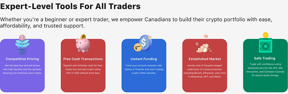
In the product offerings section, I noticed that the original brand colours posed accessibility issues due to its contrast ratio. There is also a lack of content clarity within the product offerings, as some of the terminology is tailored to experienced traders.
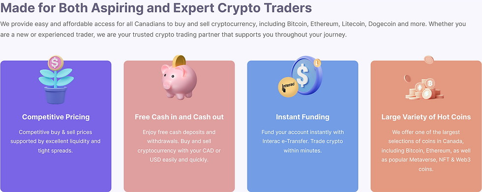
In the redesigned product offerings section, I adjusted the brand colours to meet WCAG AA/AAA standards and increased text sizes to ensure legibility. I also added "Safe Trading" as an additional product offering to emphasize VirgoCX's mission of providing users with the opportunity to trade securely. I also simplified the wording of the content to ensure that anyone, whether a new or experienced trader could understand and make an informed decision.
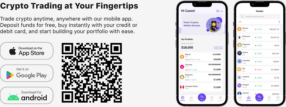
In the original download section, the graphical representation of the mobile app does not clearly depict what benefits the trader would receive from using it. It is important to effectively guide users' attention to key elements that would help inform their decisions of using the app.

In the redesigned download section, I replaced the original graphical representation of the mobile app with screens that would guide the trader to important information such as the dashboard showcasing their portfolio and the market with all the cryptocurrencies. I also reworded the content, removing any unnecessary jargon to ensure that it is clear, concise, and aligned with user needs.
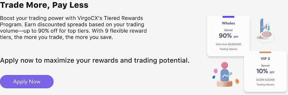
In the original rewards section, the content was vague and did not provide a clear picture as to what benefits the user would receive from applying to the rewards program.

In the redesigned rewards section, I reworded the content, removing any unnecessary jargon to ensure that it is clear, concise, and aligned with user needs. I added a CTA that would guide users to another page where they could learn more about the rewards program and make an informed decision.
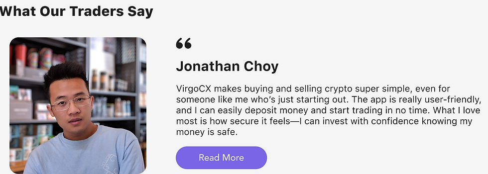
Building Trust
VirgoCX's unique selling proposition is its emphasis on its reliability, security, and ease of use. Adding a testimonial section to VirgoCX builds trust and credibility by showcasing real user experiences, making the platform feel more authentic and relatable. It encourages new users to join by highlighting key features that could help users make informed decisions. Testimonials also boost engagement, improve SEO, and strengthen VirgoCX’s reputation by spreading positive word-of-mouth. Additionally, they provide valuable feedback for improvement and help increase conversion rates by building confidence in potential users.
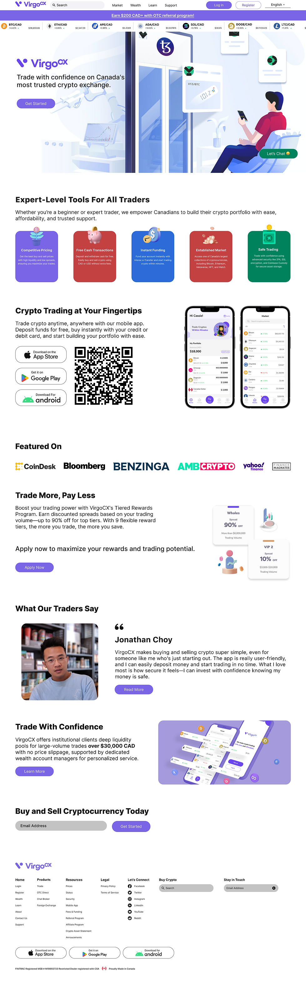
Final Design
The redesign of VirgoCX was undertaken to enhance user experience, improve accessibility, and align the platform with the needs of both beginner and experienced crypto traders. By focusing on simplifying navigation, emphasizing key features like security and ease of use, and incorporating user feedback, the redesign aimed to create a more intuitive and engaging interface. The outcome was a cleaner, more user-friendly platform that better communicates VirgoCX’s unique value propositions, such as competitive pricing, instant funding, and safe trading. As a result, user engagement increased, trust in the platform grew, and more users felt confident joining and trading on VirgoCX. The redesign successfully achieved its goals, making crypto trading more accessible and enjoyable for everyone.